Attribute Led Display
The widget evaluates a simple condition and displays a green LED when the condition is met, or a red LED when it is not.
Widget setting
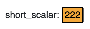
It is possible to set the widget in the backend. The following image shows an example of a widget setting.

The widget takes the actual value of the selected device’s attribute. In this example, the attribute is double_scalar attribute from the sys/tg_test/1 device. The value is compared to a defined ‘Compare value’ using a relation. In this case, is more than. If the value matches the condition, the LED widget displays a LED based on the selected style, in this example it is orange.
It is possible to customize the widget settings from the inspector panel (in edit mode), as shown below:
Input value |
Description |
|---|---|
Device |
Type in a device name (or * to list all devices) |
Attribute |
Once a device is selected, type in an attribute name (or * to list all available attributes) |
Relation |
Specify the type of relation. It could be: “is more than”, “is less than”, “is equal to”, “is more than or equal to”, “is less than or equal to” |
Compare |
Specify the target value (number or string) |
True Color |
Specify the color that the led assumes when the actual value matches the condition |
False Color |
Specify the color that the led assumes when the actual value doesn’t match the condition |
Size of LED |
The size of the LED. It is express in units |
Text Size (in units) |
The size of the text. It is express in units |
Show Attribute Value |
shows the actual value to the right of the LED when enabled |
Show Device Name |
Displays the tango database name when enabled |
Attribute Display |
Select the Label, Name, or None for the attribute |
Align Text on Center |
Aligns the text to the center when enabled |
Align Value on Right |
Aligns the value to the right when enabled |
Custom CSS |
Write custom CSS for the widget container. The syntax is the same as standard CSS used in HTML files |