Attribute Scatter
A widget that plots value of two attributes on X & Y axes.
Widget setting
The following image shows an example of a widget setting.
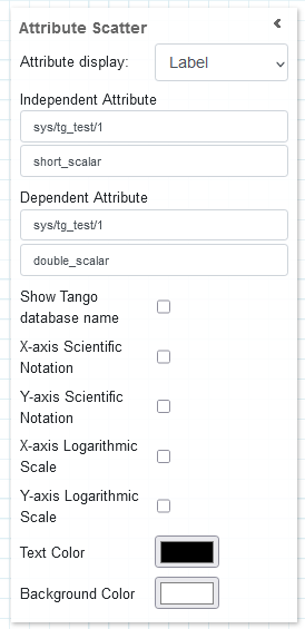
It is possible to customize the widget settings from the inspector panel (in edit mode), as shown below:
Input value |
Description |
|---|---|
Attribute Display |
Defines how much time (in seconds) is shown on the x-axis of the plot |
Independent Attribute |
Type in a device name and an attribute name (or * to list all) |
Dependent Attribute |
Type in a device name and an attribute name (or * to list all) |
Show Tango Database Name |
Displays the tango database name in front of the attribute name |
X-axis Scientific Notation |
Enable this option to display the X-axis values in scientific notation |
Y-axis Scientific Notation |
Enable this option to display the Y-axis values in scientific notation |
X-axis Logarithmic Scale |
Enable to apply a logarithmic scale to the X-axis |
Y-axis Logarithmic Scale |
Enable to apply a logarithmic scale to the Y-axis |
Text Color |
Specify the text color for the given widget |
Background Color |
Specify the background color for the given widget |
The widget plots two attributes on the X and Y axes, the first on X, the second on Y.
The values are plotted as + markers and the actual values can be viewed by hovering over a marker.
The X and Y axes increase depending on the attribute values. The widget shows all attribute values from the beginning.
Widget design
Taranta is using the Plotly framwork to render the plots. The range of the X & Y axes self-adjusts to fit all data points for every plot being displayed. By hovering over the widget in run mode, additional options are made available from a toolbar, such as zooming and panning. These come from the plotly framwork itself, but the functionality of two of them have been overwritten to better suit Taranta. By clicking autoscale, the time-window mode is disabled, and the y-axis instead covers all data points it has registered so far. To go back to the windowed mode, click on Reset axis.
This widget gives clear picture about range of value for two attributes.
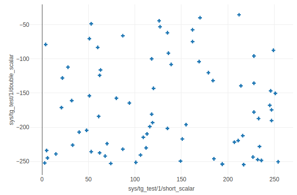
The same plot in run mode, showing all the data points received from begining for both of the attributes.