Device Status
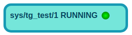
The widget shows the state (ON, OFF, RUNNING etc.) of a device.
In particular, the widget displays a led with a target color representing the state of the device.
Widget setting
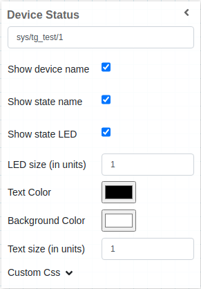
The following image shows an example of a widget setting.
The widget takes the actual value of the state of selected device. In this example the widget will show the STATE of the device sys/tg_test/1.
It is possible to customize the widget settings from the inspector panel (in edit mode), as shown below:
Input value |
Description |
|---|---|
Device |
Type in a device name and an attribute name (or * to list all) |
Show Device Name |
Displays the device name when enabled |
Show Tango Database Name |
Displays the tango database name when enabled |
Show State Name |
Displays the state name when enabled |
Align Value on Right |
Aligns the value to the right when enabled |
Show State LED |
Displays the state LED when enabled |
LED Size (in units) |
Specify the size of the LED |
Text Size (in units) |
Specify the font size of text |
Link To |
Provide the URL. In run mode the label text is displayed as a hyperlink, that opens up the target in a new browser tab if clicked |
Custom CSS |
Write custom CSS for the widget container. The syntax is the same as standard CSS used in HTML files |
Color mapping of LED
Color |
State |
|---|---|
Green |
ON, OPEN, EXTRACT |
Dark Green |
RUNNING |
White |
OFF, CLOSE, INSERT |
Light Blue |
MOVING |
Yellow |
STANDBY |
Red |
FAULT |
Beige |
INIT |
Orange |
Alarm |
Magenta |
DISABLE |
Grey |
Unkown |
The example below shows a device with status RUNNING.
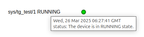
When hovering over the widget, the first line of the toolip shows the timestamp of the value,
while the second line displays the status attribute value of the configured device.
Applying CSS to widget
The user can also write css under Custom CSS section. The css syntax is same as we write for html files.
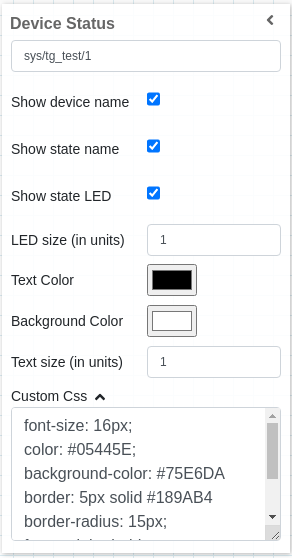
The CSS rules written in Custom CSS section are applied to the widget as below: