Attribute Plot
A widget that plots the value of one or serveral devices attribute over time. The plotting of attributes is based on a Time Window, which defines the duration (in seconds) covered by the plot’s x-axis. At any given time, the widget plots each included attribute over the last n seconds, where n is the size of the time window.
Widget setting
The following image shows an example of a widget setting.
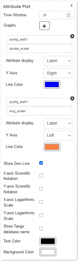
It is possible to customize the widget settings from the inspector panel (in edit mode), as shown below:
Input value |
Description |
|---|---|
Time Window |
Defines how much time (in seconds) is shown on the x-axis of the plot |
Graphs |
Opens the configuration for individual plots (see below) |
Show Zero Line |
A zero line is drawn on the graph when enabled |
X-axis Scientific Notation |
Enable this option to display the X-axis values in scientific notation |
Y-axis Scientific Notation |
Enable this option to display the Y-axis values in scientific notation |
X-axis Logarithmic Scale |
Enable to apply a logarithmic scale to the X-axis |
Y-axis Logarithmic Scale |
Enable to apply a logarithmic scale to the Y-axis |
Show Tango Database Name |
Displays the tango database name in front of the attribute name |
Text Color |
Specify the text color for the given widget |
Background Color |
Specify the background color for the given widget |
Graph configuration
When clicking on the Graphs option, a new plot can be configured with the following settings:
Input value |
Description |
|---|---|
Device |
Type in a device name (or * to list all) |
Attribute |
Once a device is selected, type in an attribute name (or * to list all available attributes) |
Attribute Display |
Select the Label, or Name for the attribute |
Y Axis |
Sets the Y axis position (left ir right) |
Line Color |
Specify the line color for the given widget |
Widget design
Taranta is using the Plotly framwork to render the plots. Each plot is automatically assigned a unique color, and the range of the y-axis self-adjusts to fit all data points for every plot being displayed. By hovering over the widget in run mode, additional options are made available from a toolbar, such as zooming and panning. These come from the plotly framework itself, but the functionality of two of them have been overwritten to better suit Taranta. By clicking autoscale, the time-window mode is disabled, and the y-axis instead covers all data points it has registered so far. To go back to the windowed mode, click on Reset axis.
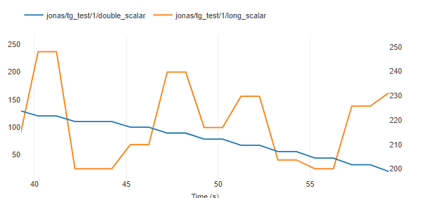
The same plot in run mode, showing all data points recieved in the last 20 seconds for both attributes.