Command
The widget enables the user to send a command with parameters to one or several devices.
Widget setting
The following image shows an example of a widget setting.
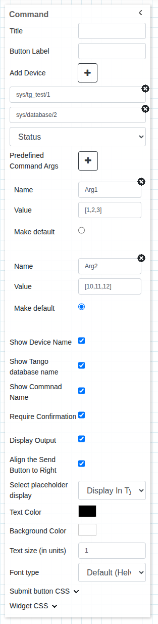
It is possible to customize the widget settings from the inspector panel (in edit mode), as shown below:
Input value |
Description |
|---|---|
Title |
Sets the title displayed for the widget |
Button Label |
Add title to the submit button |
Add Device |
Add Device button that allows the user to add one or more devices |
Device |
Type in a device name (or * to list all devices) |
Command |
Once a device is selected, select a command |
Predefined Command Args |
A way to define name, value pair as input/argument to the command |
Show Device Name |
Displays the device name when enabled |
Show Tango Database Name |
Displays the tango database name when enabled |
Show Command Name |
Displays the command name when enabled |
Require Confirmation |
Shows a pop-up to the user to confirm to send the command when enabled |
Display Output |
Displays the output coming from TANGO when enabled |
Align the Send Button to Right |
Aligns the send button to the right when enabled |
Select Placeholder Display |
Defines what is shown in the widget when no command is selected |
Text Color |
Specify the text color for the given widget |
Background Color |
Specify the background color for the given widget |
Text Size (in units) |
1 corresponds to 1em text size |
Font Type |
Choose a font family. Either the default or Monospaced |
Submit Button CSS |
Write custom CSS for the submit button. The syntax is the same as standard CSS used in HTML files |
Widget CSS |
Write custom CSS for the widget container. The syntax is the same as standard CSS used in HTML files |
Widget input
The widget displays an input for sending arguments to the device/devices based on the command’s accepted input type. Command arguments are divided in three types:
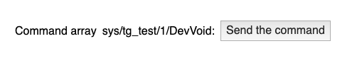
Void: Commands that do not accept any arguments belong to the Void input type, and the widget hides the input field.
Value: Commands that accept a single value as input (e.g., Float, String, Char) display an input field where the user can enter the value to send as an argument.
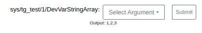
Array: Commands that accept an Array as input display a text field where the user can enter the array in the format value1, value2, …., valueN, with values wrapped in double (”) or single (’) quotes depending on the type. Use ‘[]’ to pass an empty array. The widget automatically convert the input into a proper array according to the command’s expected type (for example, 0 becomes False if a Boolean is expected).

- Predefined Argument: A user can also define a list of arguments for the widget during the configuration phase. This can be done using the
Predefined Command Argssection. The user can define the list of values (name-value pair) using the plus+button. While defining the values, the name field is optional; in such cases, the value will be used as the name/label in the dropdown. During run mode, these configured values are shown in a dropdown (instead of a text input) from which the user can select a value and execute the command.
- Predefined Argument: A user can also define a list of arguments for the widget during the configuration phase. This can be done using the

The user click the execute button to execute the command. A pop-up may show up for confirmation if the Require Configuration checkbox is checked during configuration.

Once the commmand is executed its ouput can be seen below the widget. Showing output is also configurable.
Applying CSS to widget
The look and feel of the widget can be customised using the Custom CSS section. CSS syntax is the same as the syntax used in HTML files.
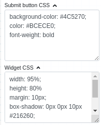
The CSS rules written in the Custom CSS section, shown above, are applied to the widget as shown below:
