Box
The widget allows the creation of complex dashboards by grouping and ungrouping widgets. A group can be placed, dragged, resized as a single item on the canvas, and can also be moved up or down within layers as if it were a single widget.
Note
Box widget supports only one level of nesting, meaning a Box widget can be placed inside another Box. In short, Box A cannot contain Box B if Box B itself contains another Box C.
Widget setting
The following image shows an example of a widget setting.

It is possible to customize the widget settings from the inspector panel (in edit mode), as shown below:
Input value |
Description |
|---|---|
Title |
Sets the title displayed for the widget |
Big Widgets Size (in row or column) |
Defines the minimum size for graph widgets |
Small Widgets Size (in row or column) |
Defines the minimum size for non graph widgets |
Text Color |
Specify the text color for the widget |
Background Color |
Specify the background color for the widget |
Border Color |
Specify the border color for the widget |
Border Width |
Specify the border width for the widget |
Border Type |
Sets the border style for the widget |
Text Size (in units) |
1 corresponds to 1em text size |
Font Type |
Choose a font family. Either the default or Monospaced |
Layout |
Sets how other widgets are placed within the Box widget |
Alignment |
Sets the alignment of the content: left, center, or right |
Padding |
Sets padding around the widget |
Custom CSS |
Write custom CSS for the widget container. The syntax is the same as standard CSS used in HTML files |
Widget input
Users can group widgets by dragging and dropping them into the Box widget, either from the widgets section or from existing widgets on the dashboard. It is also possible to move widgets between different Box widgets on the canvas.
Widgets dropped into a Box widget are aligned according to the layout defined by the user. The available layouts are:
Vertical: Each widget is rendered on a seperate row.
Horizontal: All widgets are rendered in a single row, side by side.
Widgets order
Widgets contained in a Box widget follows the order defined by the user. It is possible to drag and drop a widget to the left (in a horizontal layout), above the stack (in a vertical layout), to the right or bottom, or even in the middle, and the order will be preserved. The widgets can also be reordered by dragging and dropping them.
Widget handler
To help users select and move the Box widget, a handler has been created. It is positioned at the top of the widget when in edit mode, defined by a grey rectangle matching the borders height and 30px wide. The handler supports both selection and drag actions, and disappears once the user switches to run mode.
Box Widget configured in Edit Mode:

Box Widget configured in Run Mode:

Sizing Inner Widget
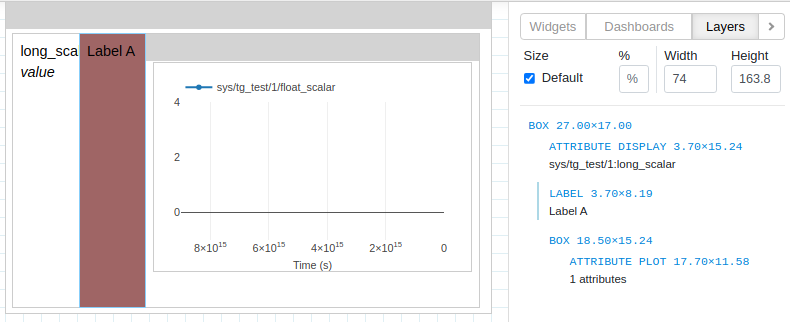
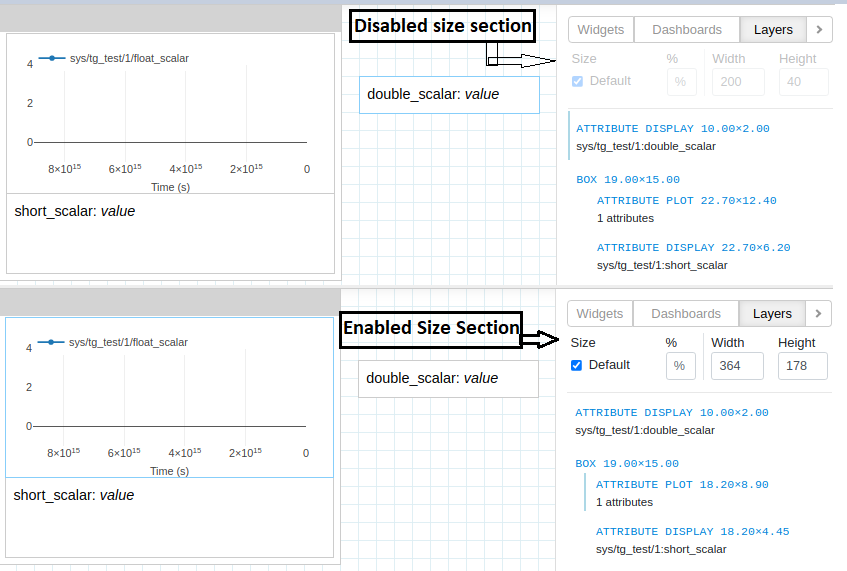
Users can resize widgets directly on the dashboard canvas. To resize inner widgets contained in a Box, use the size section in the Layers tab.
Inner widgets can be selected either from the canvas or from the Layers tab.
The selected widget in the Layers tab is highlighted with a light blue border. The Size section under the Layers tab becomes active when an inner widget is selected.
Inner widgets are widgets contained within a Box Widget. An inner widget can be a normal widget or another Box Widget.
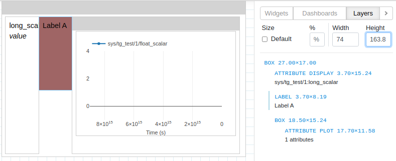
Size can be adjusted via the Percentage field. Percentage applies to the height for vertically aligned Box widgets and to the width for horizontally aliged Box widgets.

Alternatively, the users can specify a custom size in pixels using the Width and Height fields.
The default layout of a Box Widget is overridden when the user changes the size of inner widgets using Percentage or Width and Height.
The layout can be reverted to the default by selecting the Default checkbox.