Spectrum 2D
The widget allows the user to plot multiple spectrum attributes on the y-axis against a single spectrum attribute on the x-axis. This one-to-many configuration lets users specify one spectrum attribute for the x-axis and several for the y-axis.
The Time Base is used as the spectrum attribute for the x-axis of the oscilloscope. Since the widget supports multiple y-axis spectrum attributes, clicking the “+” sign next to Graphs allows the user to add another spectrum attribute and choose a line color for it.
Widget setting
The following image shows an example of a widget setting.

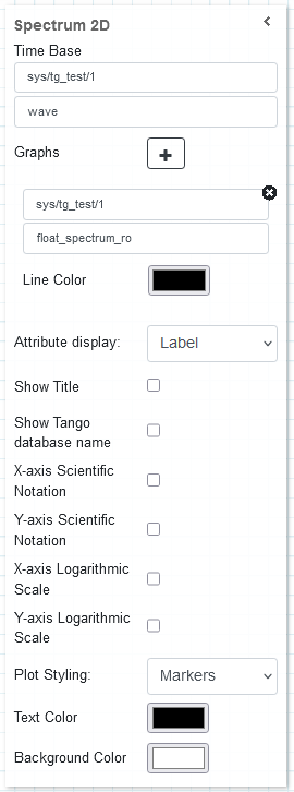
It is possible to customize the widget settings from the inspector panel (in edit mode), as shown below:
Input value |
Description |
|---|---|
Device |
Type in a device name (or * to list all) |
Attribute |
Once a device is selected, type in an attribute name (or * to list all available attributes) |
Graphs |
Opens the configuration for individual plots (see below) |
Attribute Display |
Select the Label, Name, or None for the attribute |
Show Title |
Displays the title when enabled |
Show Tango Database Name |
Displays the tango database name when enabled |
X-axis Scientific Notation |
Enable this option to display the X-axis values in scientific notation |
Y-axis Scientific Notation |
Enable this option to display the Y-axis values in scientific notation |
X-axis Logarithmic Scale |
Enable to apply a logarithmic scale to the X-axis |
Y-axis Logarithmic Scale |
Enable to apply a logarithmic scale to the Y-axis |
Plot Styling |
The option of adjusting the style of plot indicators |
Text Color |
Specify the text color for the given widget |
Background Color |
Specify the background color for the given widget |
Graph configuration
When clicking on the Graphs option, a new plot can be configured with the following settings:
Input value |
Description |
|---|---|
Device |
Type in a device name (or * to list all) |
Attribute |
Once a device is selected, type in an attribute name (or * to list all available attributes) |
Line Color |
Specify the line color for the given widget |
The y-axis contains four spectrum attributes representing four dictinct channels and their waveform voltages from an ossiloscope plotted against another spectrum attribute called time-range

The y-axis, plotted against the spectrum attribute called `float_spectrum_ro`, contains:
two spectrum attributes, `float_spectrum_ro` and `double_spectrum_ro`, are drawn on a Bar Chart plot using scientific notation format and a logarithmic scale on the y-axis (left),
one spcetrum attribute, `float_spectrum_ro`, is drawn on a Marker plot (right).
Widget design
The plot is rendered using plotly, a robust and interactive graphing library. The plots are re-drawn as they are updated with spectrum attribute data pushed by the respective tango device to which the attributes are associate. Plotly natively provides a couple of tools for interacting with the plots, including zooming, panning, focusing on specific graph parts, resetting axes and saving snapshots of the graph as Portable Network Graphics(PNG) files.

The plot shown above is a sample of a four channel oscilloscope plotted against (psuedo) time-range

The plots above, plotted against `float_spectrum_ro`, shows:
spectrum attributes `float_spectrum_ro` with `double_spectrum_ro` drawn on a Bar Chart plot with scientific notation format and logarithmic scale on y-axis (left),
spectrum attributes `float_spectrum_ro` drawn on a Marker plot with linear scale on both axes (right)